
Over the last day or two we've been quietly releasing some tweaks to how we display game images across the site. This post is a quick rundown of what's changed.
The default tiled layout
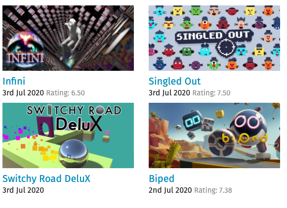
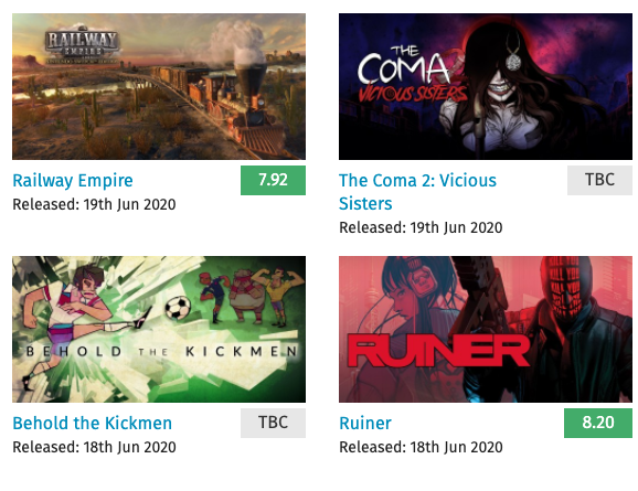
The aim here was to tighten up the layout, tweak the font size, and show the rating "badges" to show green, orange or red depending on the score.
We also added a long-standing change to hide ratings on most pages until a game has 3 ratings, and instead show "TBC". We're also showing "TBC" for a game with no reviews, whereas before we didn't show anything at all.
This affects quite a few pages:
- The left column of the homepage
- The Games homepage
- Recent releases
- Upcoming releases
- Browse by title
- Browse by category / tag
- Browse by series
Here's how it looked before:
And here's how it looks now:
Partner game pages
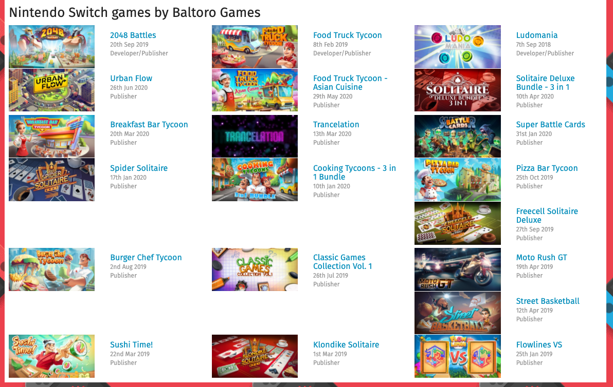
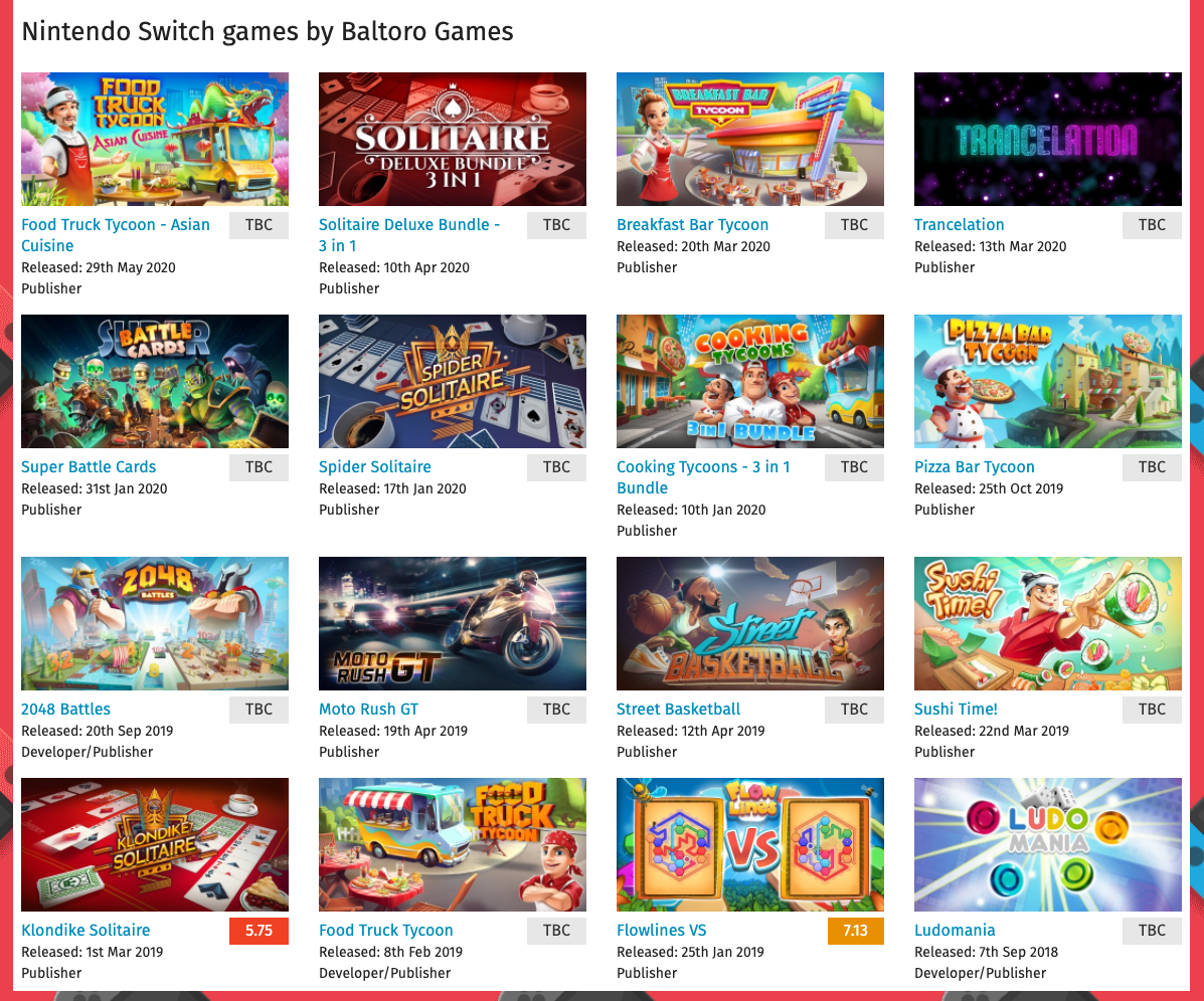
We wanted to roll out the same design for the other pages, with a small edit to show Developer, Publisher, or Developer/Publisher, to show the partner's involvement in each game linked to them.
You can see how the original layout had a bug where spaces appeared on the page, which we also wanted to fix. Furthermore, the ordering of items showed Developer/Publisher items first, Publisher next, and Developer last. Each list was sorted by date, newest first, whereas we wanted to sort the whole page as one list.
Here's how it looked before, using Baltoro Games as an example:
And here's the result of our changes:
All in all, we think this makes for a nicer-looking site, and is much tidier.
Hope you like it!